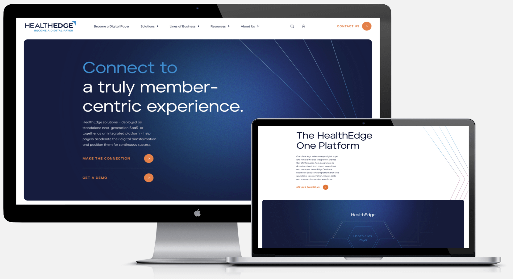
HealthEdge: A rebrand with an edge
Digital solutions provider HealthEdge has a mission to help health plans transform from traditional organizations limited by siloed, manual solutions into transparent, modern digital payers. But as HealthEdge grew, that narrative became blurred. They needed a new way to unify and communicate that message to their customers and prospects—visually and conceptually, from corner to corner of their brand.

A new look, launch and collateral
We provided a visual identity refresh, unified messaging and a brand story that elevates their platform. Anchored by the tagline “Become a digital payer,” we paired messaging around the idea of enabling a connective transformation with a strong, distinctly modern and sophisticated visual language.
Keywords:
A sharper identity to match their vision
The new logo leverages an exponent that we refer to as “The Edge.” It’s suggestive of their evolving line of products and services and their mission to always push the healthcare industry forward. As we’ve been expanding their story and visuals, the one constant is HealthEdge’s desire to lead an industry that has been desperate for a voice. Our approach complements that notion in a way that’s visually impactful without being overpowering.
